Optable Technologies
Overview: The objective of the page header project was to minimize vertical spacing across the platform, ensuring a uniform appearance across pages. The aim was to provide users with immediate clarity about the page content upon first view, eliminating the need for scrolling to access valuable information. Initially, I concentrated on enhancing the creation page, followed by refining the post-creation layout. This initiative extended from my recent revamp of platform forms.
Page Header

Creation Flow

Post-Creation Flow
UX Research
Motivation
Across our platform, there was a notable lack of consistency among pages, with some featuring comprehensive titles and descriptions while others lacked them entirely. Typically, the top section of each page contained generic information like the name and description. However, due to the size of our fields and spacing, crucial data remained obscured until users scrolled past this general section. Every page appeared the same at first glance, failing to show actual content until further down. To address this, I introduced page headers to bring the information of general section up, and liberating space for the essential content users seek.
User Interviews
Formal user interviews weren't conducted for this project. However, numerous complaints from clients reached our sales team regarding the vertical spacing of forms. Because of this, the team prioritized an immediate update. These client complaints primarily centered on excessive scrolling required to locate desired information. Below, I've included an example of the original screen layout.
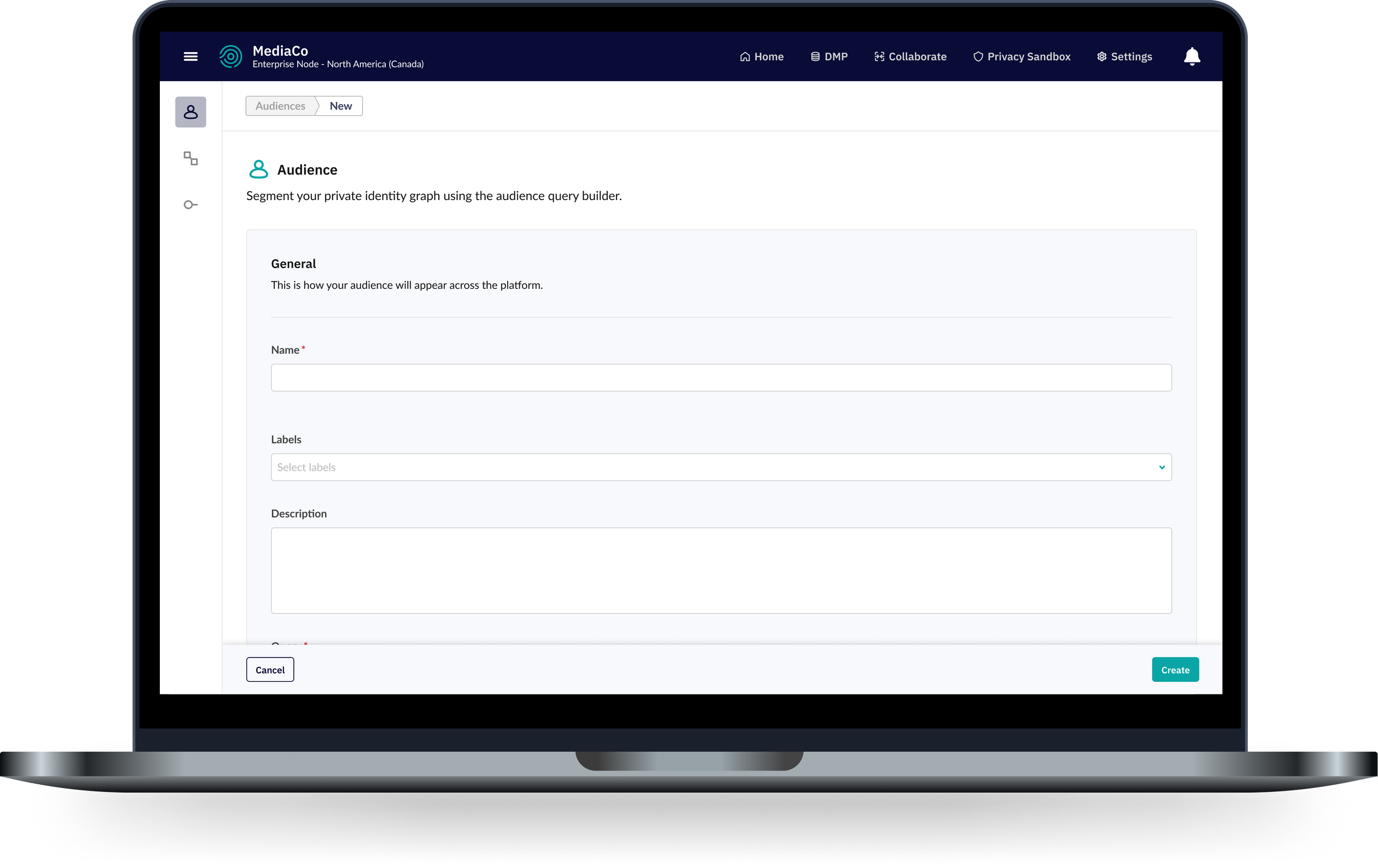
This is what the platform looked like after my forms revamp. I had implemented a page header but that just showed the user where they were on the platform. As you can see, when a user landed on this page they were met with name, labels and description as the first fields. In order to see the query builder, users had to scroll down past this general section.
The objective was to consolidate all this information and move it into the page header, thereby freeing up valuable real estate for high-priority content like data. This optimization was particularly crucial for post-creation pages, where users typically went on these pages to edit the actual content. Since users were already familiar with the general information at this stage, it was essential to streamline their access to the rest of the page, making it the focal point of the page.
UX/UI Design
Project Timeline
Collaborating with the PM, we identified pages that could benefit from the page header revamp, particularly those featuring content such as name, description, and labels. With this prioritization in place, I continued on with the design process, ensuring that the new page header would accommodate various use cases across different pages. This approach aimed to optimize user experience and consistency throughout the platform.
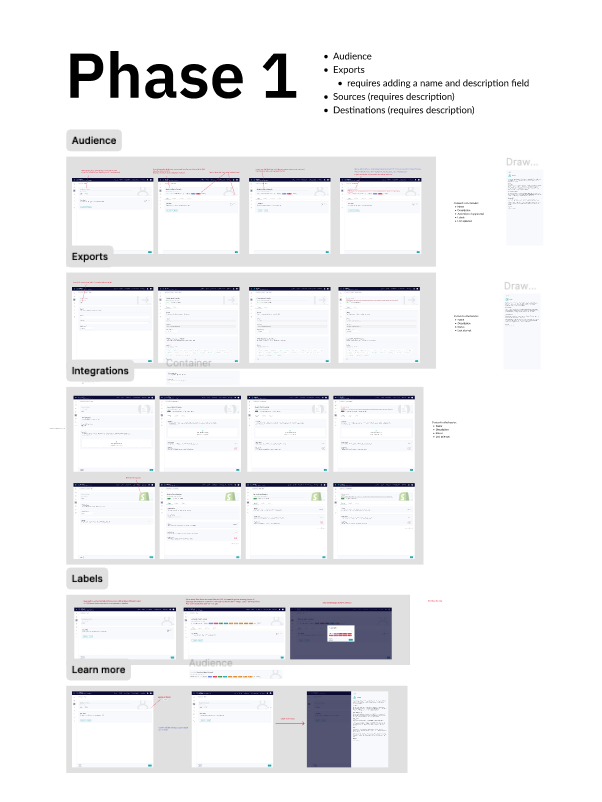
This is how I separated out my Figma document. Each page had its own section, and I would jump from page to page to make sure everything was cohesive. This is the document that was handed off at the end of the project (more details at the end).
Wireframes
No formal user interviews were done for this project as we received many complaints from clients to our sales team about the form vertical spacing, and therefore the team decided to update it asap. I knew the painpoints from these clients were that they had to scroll too much to find the information they want. Below I present what the original screen looked like before working on combining the general information into a page header.

Started with wireframing but due to the timeline for the project I moved very quickly to higher fidelity. This was the first iteration.

High - Fidelity
I experimented with many iterations throughout the project. While I initially considered the version described earlier for implementation, I had doubts regarding its efficacy. Specifically, the hover/edit mode in post-creation made me question its suitability. Below, you can see an example of this mode, which led to my reconsideration of this design direction.


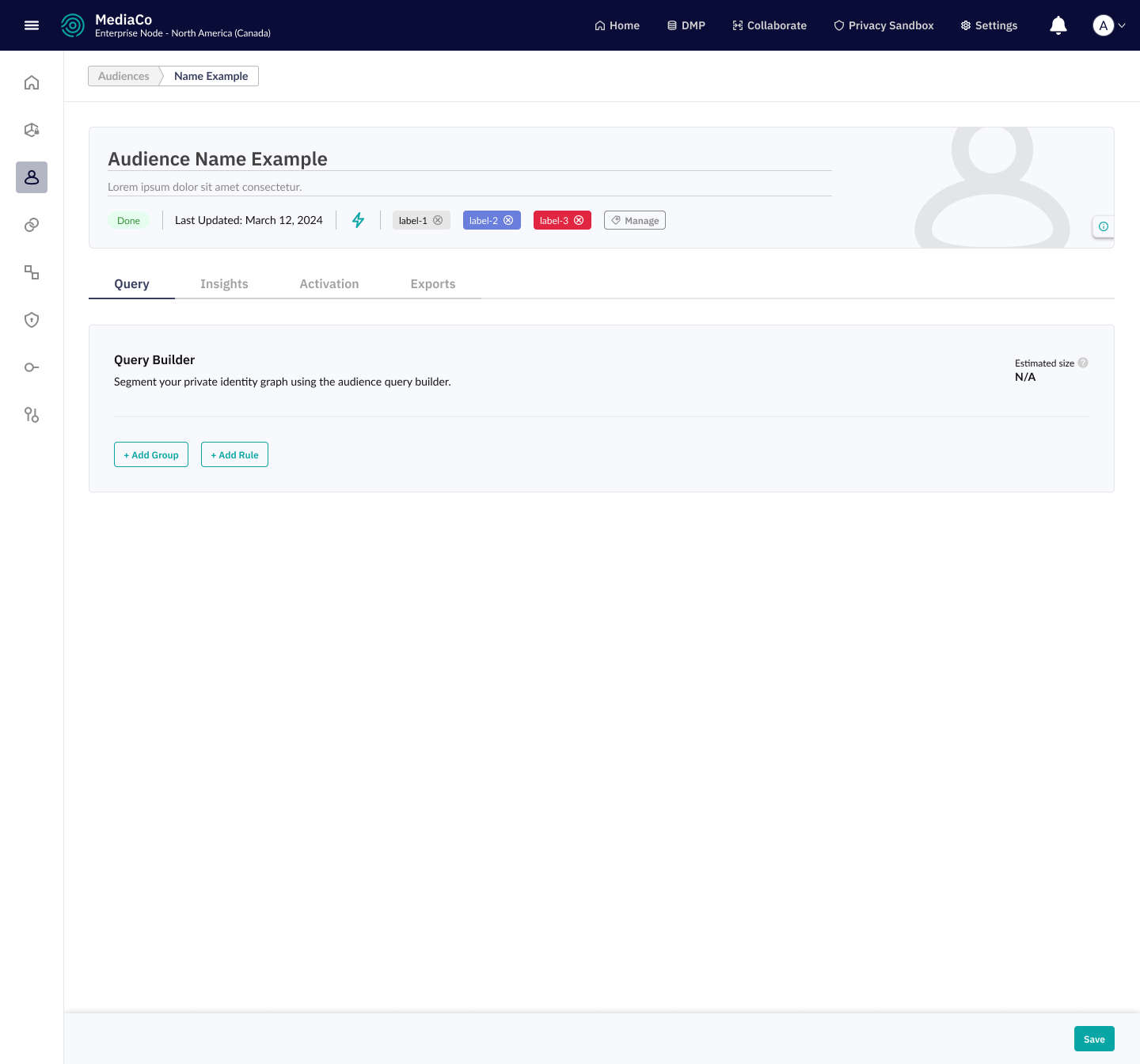
The initial version of the page header felt bland, lacking clarity in the visual hierarchy of the overall page. The cramped edit mode added to the sense of blandness and the absence of a clear anchor point. Because of the rushed timeline, we considered moving forward with it as a temporary solution, given its effectiveness in addressing the main pain points. However, I began exploring the possibility of implementing a design similar to the one used for the forms revamp, which involved placing the header in its own distinct box. This approach provided a more structured and visually appealing layout, enhancing the user experience while maintaining consistency with previous design improvements (two birds, one stone!).

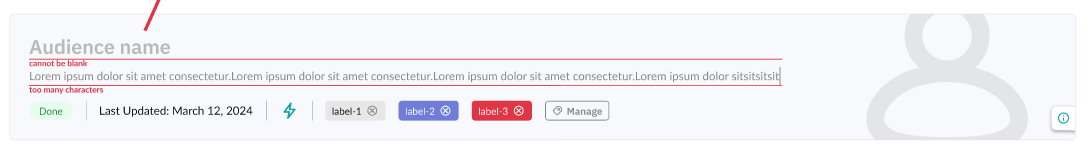
The page began to feel cohesive and well-structured with the introduction of the box around the page header. This design choice effectively anchored the header, highlighting its significance in the visual hierarchy without overshadowing other information. I incorporated a hover-over information icon for quick access to documentation and changed the edit mode to a simple underline, offering a cleaner aesthetic. The edge cases like error messages were a challenge, as they required enough space to accommodate varying lengths of text while maintaining a balanced layout. After careful consideration, here's the final design I arrived at, striking a balance between clarity and space efficiency.
Iterations
Key Takeaways

Some of the elements of my design needed to be tweaked once development started. The spacing for the error message was one of the elements that needed tweaking due to tightness on the platform. There were a few other minor changes, but overall, the design proved to be effective. Collaborating closely with the UI developer, we ensured that spacing, sizing, and other aspects worked within the page context. Sometimes what looks good in Figma might require adjustments for the final implementation. Currently, the implementation is underway on a few pages, with the development team working incrementally to roll it out across the platform.
Navigating a rushed design process under pressure from project managers was challenging. Despite the time constraints, I remained committed to delivering the best possible outcome for the platform. It was tempting to settle for the first "decent" design, but I'm grateful for the opportunity to iterate and refine until achieving a final version felt and looked right. Taking the extra time to finalize things proved crucial, as rushing could have led to the need for further adjustments down the line. I'm confident that the revamped page header will have a positive impact on our users and effectively address the concerns raised by our clients, ultimately enhancing their experience with the platform.