Optable Technologies
Table Listing Revamp
Overview: I revamped the tables throughout the platform to address scalability issues and improve visual hierarchy. The previous table listings were not scalable, with left-aligned content that disrupted the flow. Additionally, inconsistencies across the platform prompted the need for a more uniform and reusable table design suitable for all pages.

UX Research
Motivation
As our platform grew, we aimed to add numerous new features. However, the listing UI created limitations for accommodating functionalities such as bulk actions and column customization. Additionally, there was a lack of consistency in component behaviors, with multiple one-off components scattered throughout the platform. The goal of this research was to identify a better approach to future-proof and categorize the listing components.
Here’s the original version of the table listing, which had numerous pain points. At this time, most of our users were internal, so the information was presented in a jumbled manner, lacking headers and proper spacing. While this worked for the current use cases, the anticipated increase in users necessitated an update to improve usability and clarity.
To prepare for user interviews, I needed to break down and research the different components of a table listing. This list of global components consisted of:
User Interviews
Table Header
CTA button
Filters
Sort
Search
Pagination
Bulk Actions
The user interviews were conducted internally due to limited resources for external interviews. I met with various teams, including sales and development, to gather their feedback on the pain points of the current listing. Here is a compilation of the top comments:

This feedback aligned with our initial discussions and definitions. From this step, we moved on to creating user personas to gain the perspective of our actual users (clients), as our previous insights were solely based on internal feedback.
We then identified individual components such as strings, labels, status pills, kebab menus, and hyperlinks that would be incorporated throughout the listings. I created a comprehensive list of each component to be used in different table listings, ensuring they would be universally applicable across the platform. This approach also allowed me to establish the important visual hierarchy for each page, ensuring consistency and usability for every use case.
User Personas
The user persona exercise was designed to help envision our users' needs and how we could achieve those end goals seamlessly with a proper UI. Our users fall into two categories: those with a technical background and those without. I focused on users without a technical background because if those users can navigate the platform with ease, then those with more experience should also have no problem.

UX/UI Design

Tier 3
Data Subject Requests
Traits
Accounts
Roles
Labels
Wireframes
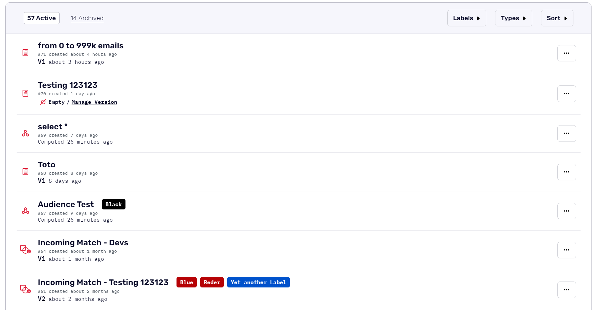
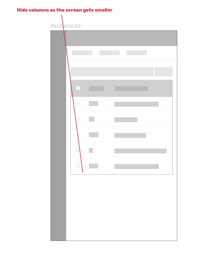
Wireframes usually start on paper before moving to Figma. Here is the final version I created after extensive research. As you can see, I added checkboxes on the left side, headers for each column, and a utility bar with search, filter, labels, type, sort, and CTA functionalities. Additionally, I ensured that the table would be responsive; as the screen size decreases, columns are hidden and the table becomes scrollable.
High - Fidelity
The branding you see here is our old branding, so I updated it when we went through our branding revamp. We also went through several iterations, updating bits and pieces as we went. I will show the final version below after the iterations and rebranding.

Iterations
The first iteration of the table listing primarily focused on implementing the utility bar. After discussions with the PM and Engineering team, we decided to postpone working on bulk actions as it required significant resources and wasn't a top priority for clients at that time. However, we revisited this project later on, and I'll share an image of the final result below.
During the development phase, there were numerous discussions regarding the placement of certain features. Ultimately, we opted to remove labels as a standalone dropdown and integrate them into the filters. This project involved several tasks, so I tackled components like the utility bar, pagination, empty states, and others individually before integrating them. This approach allowed me to focus on each section properly without being distracted by other parts of the table listing, ensuring attention to detail and coherence.
Key Takeaways
Throughout the project, several key takeaways emerged. First and foremost was the importance of prioritization. By breaking down the project into tiers and focusing on the most problematic pages initially, we were able to efficiently allocate resources and address critical issues promptly. This approach ensured that our efforts were directed where they were most needed. Additionally, our iterative approach to design was very effective for a project of this size. Starting with wireframes and refining them based on user feedback and team discussions allowed for continuous improvement and refinement of our design, leading to a more polished final product.
Project Timeline
Working with the PM, we decided to divide this task into tiers to facilitate easier implementation by the engineering team and to allow us to observe user reactions and iterate if needed. We prioritized the most problematic pages and those most in need of a revamp. This approach enabled me to focus on one page at a time, hand it off, and then move on to the next, avoiding the complexity of managing everything simultaneously (those Figma files can get messy). Thanks to the earlier research and setup, I was confident that our solutions would be effective across all pages.
Tier 1
Clean Room: AnalysisParticipantsPrivacy LogInvites: Info drawer
Clean Room: MatchesHistory
AudiencesExports
Tier 2
Sources
Destinations
Export
Export summary
Partnerships