The problem
Over 80% of map traffic came from mobile, but conversion lagged 4x behind desktop.
- Pins were large, colorful, and competing with each other
- Hovercards were cluttered and hard to scan
- The experience broke down on small screens
- Most partner loads (Bandsintown, Skiddle, Jambase) happened in constrained mobile iframes, a real revenue problem
Before
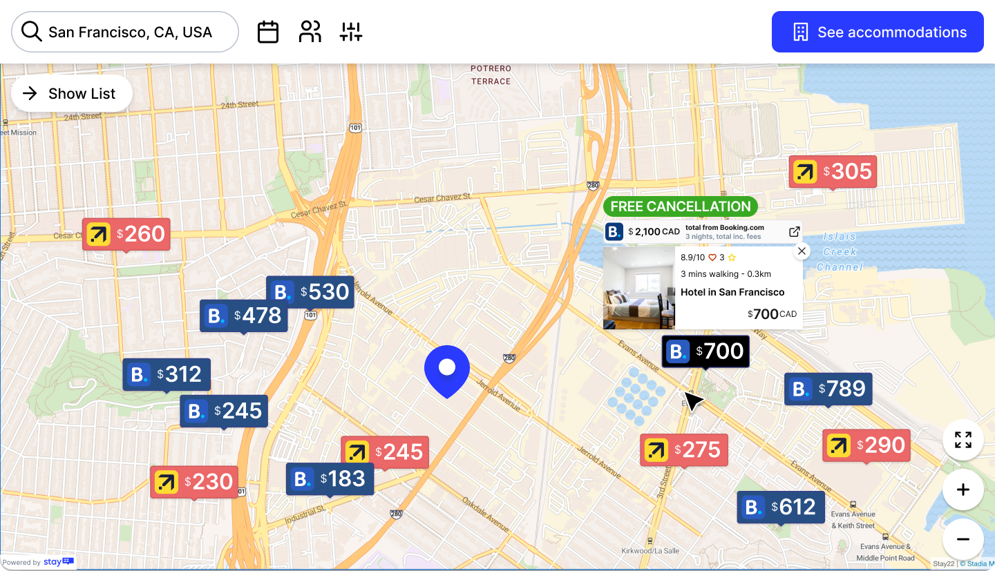
The original map, competing pin styles, cluttered hovercards, and no adapted experience for small iframe sizes.
After
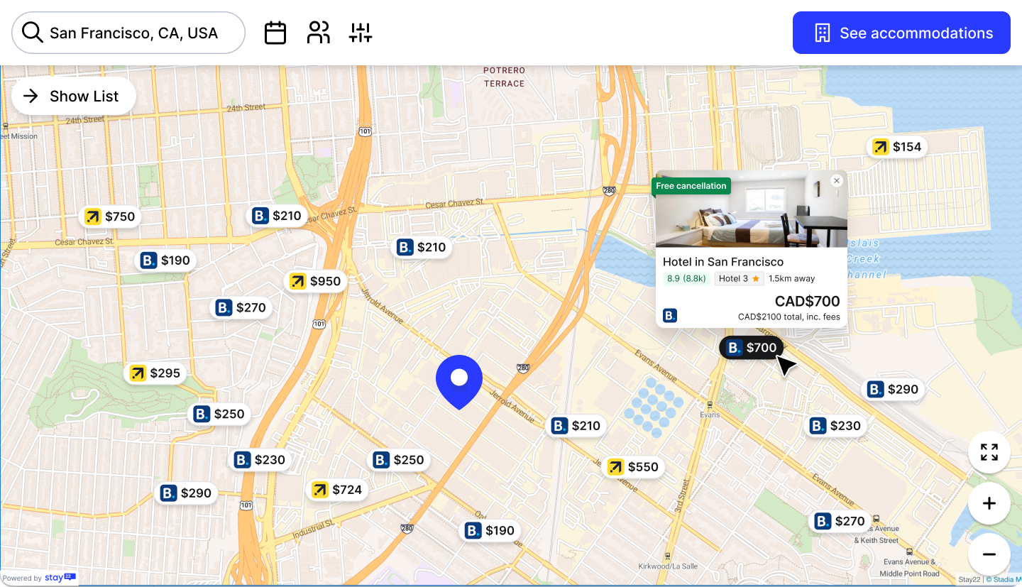
The redesigned map, consistent pin system, streamlined hovercard hierarchy, and a cleaner visual baseline across all partner contexts.
The constraint
Partners control the iframe size. We can't change that.
- No control over the canvas meant every decision had to be resilient by default
- This shaped almost every call that followed
Research
Before touching any designs, we dug into the data, conversion rates, iframe sizes, where the drop-off was actually happening. I mapped existing user flows and ran competitive benchmarks to understand what others were doing. Then we ran a 118-person survey across Reddit travel communities and internal users to validate what information people actually need when booking near an event.
The finding: we were showing too much.
- 92% of external users ranked proximity to venue as their top priority
- 81% ranked price second, reviews came third at 49%
- Cancellation policy, amenities, parking, all ranked far lower than assumed
- Users don't need six data points to decide. They need three.
The research gave us something just as important as insights, it gave us something to point to. Removing information from a product that wasn't technically broken is a hard sell internally. Having the data made those conversations a lot easier.
The design
I redesigned three interconnected areas of the map experience.
- Pins: stripped to a clean, consistent system. Visual noise reduced. Selected state clearly communicated. Partner brand marks kept (a hard requirement).
- Hovercards: rebuilt around the research findings: photo, name, rating, distance, price. Scannable in seconds.
- Minimized map: for iframes under 350px, a primary CTA, a secondary map link, and a simplified preview. A dedicated experience rather than a broken one.
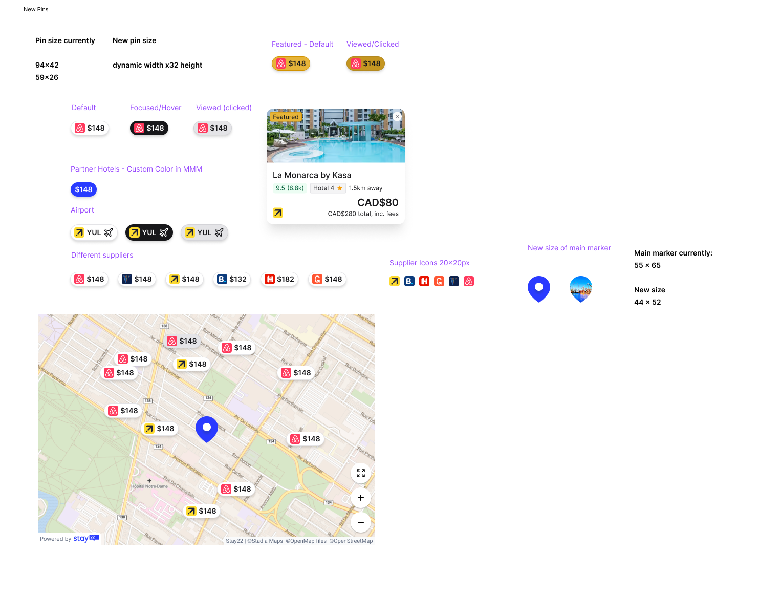
New pin system, reduced from multiple competing sizes and colors to a single consistent style. States cover default, hover, selected, and partner-branded variants.
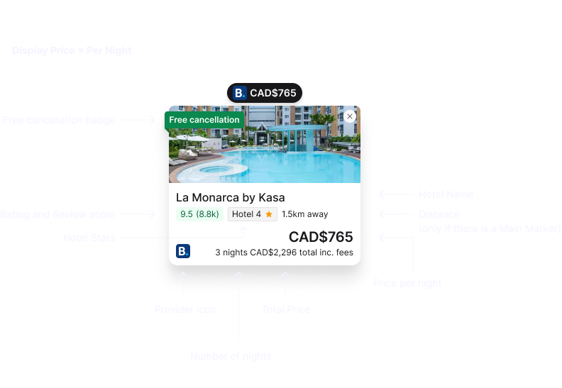
Hovercard anatomy, rebuilt around the five data points users actually need: photo, property name, rating, distance, and price per night.
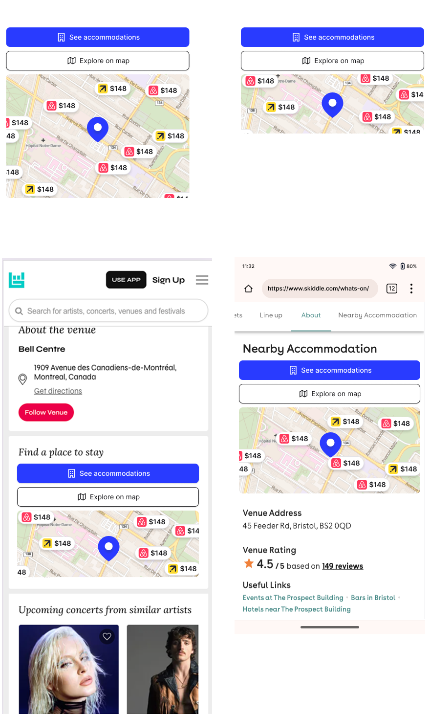
The minimized map embedded in Bandsintown and Skiddle, two of our largest live event partners. Designed to work at 217px and 349px iframe heights.
Validation
We A/B tested the minimized map variant across all partners.
- 50/50 split across November–December 2025
- Test concluded, merged into production, and rolled out across all partner integrations
- Partner feedback has been positive
Takeaway
The constraint was the brief. Not controlling the canvas forced more resilient design thinking. Every decision had to hold up across screen sizes, partner brands, and user contexts we couldn't fully predict. Starting close to PM and engineering from day one meant fewer surprises, and the research genuinely changed the output. The hovercard would have been more cluttered without it.