The problem
Two things weren't working. First, partners only earned when they explicitly mentioned a specific hotel. General destination content, city guides, itineraries, 'top things to do' articles, converted nothing, even when those pages had high travel intent and significant traffic. We were leaving a lot of revenue on the table. Second, even on pages that did mention hotels, the primary CTA was a text link. We wanted to test whether a richer visual widget could outperform it, driving more click-through and booking intent without feeling like an ad.
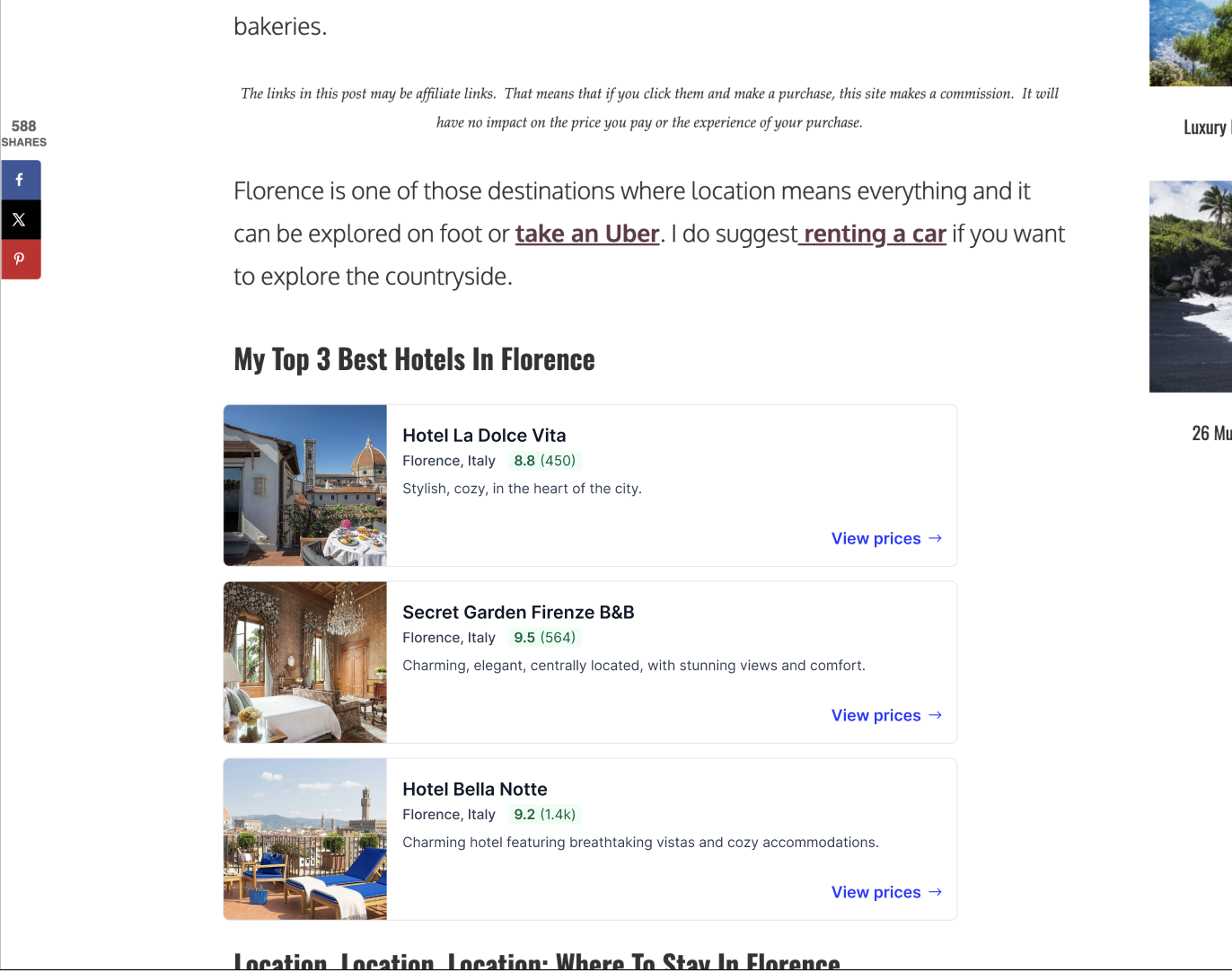
The widget embedded in a real partner blog, sitting inline between editorial content with hotel photo, rating, and a 'View prices' CTA.
The constraint
Our partners are bloggers and creators. They want passive income, not a technical integration project. The widget had to feel native to their content, editorial, not promotional. If it looked like a banner ad, partners wouldn't use it. If it felt out of place, readers would scroll past it. That constraint shaped every design decision.
Research
Before designing anything, we analyzed the top 10 and bottom 10 performing partner blogs to understand what actually drove conversion. We also ran a competitive benchmark across other travel widgets to understand how the space was approaching the same problem.
- 9/10 top-performing blogs placed the widget in the top half of the page, immediately after a 'where to stay' section header
- 3 listings converted best, more created decision fatigue, fewer felt incomplete
- Low travel intent pages converted near zero regardless of design or placement
- Blanket auto-insertion on every page inflated load counts but killed performance metrics
The research pointed clearly in one direction. Placement and intent matter more than almost anything else. That insight directly informed the auto-injection feature we scoped next, automatically placing the widget at the highest-intent moments in an article without requiring partners to manually embed it. That work was in progress when the project was paused.
The design
I designed two layout variants to serve different blog contexts.
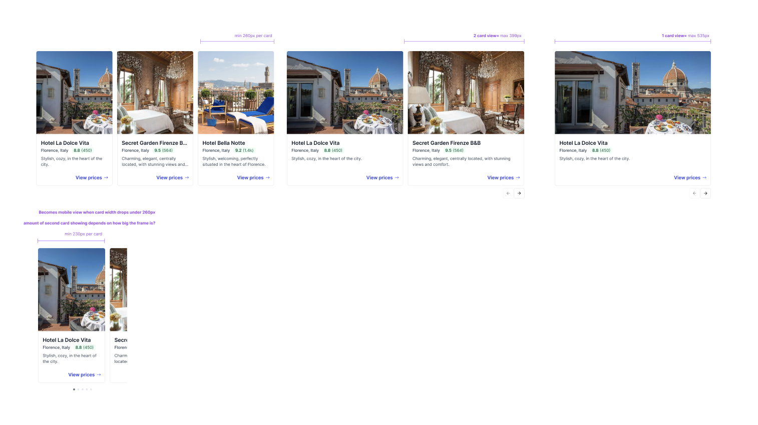
- Carousel: an editorial, horizontal scroll format suited to city guides and itineraries. Feels like curated content, not a widget.
- List: a vertical, comparison-friendly format for readers who are actively evaluating options. More scannable, better for single-destination pages.
Both variants were designed to be fully responsive across mobile (340px minimum) through desktop, with image-led cards showing hotel name, location, rating, and a short description. No price displayed, the design leans into an editorial, recommendation feel rather than a booking interface. The CTA does the conversion work.
One of the more interesting decisions was whether to show price at all. Showing price drives higher intent but can create friction before the click. We went without, keeping the widget feeling native to the content, closer to a curated editorial recommendation than an ad. We A/B tested CTA copy, 'View prices' vs. 'Check availability.' View prices won, which was a telling signal: users responded to price transparency as a concept even without seeing the actual number.
Carousel variant, horizontal scroll format showing hotel cards with photo, name, rating, and CTA.
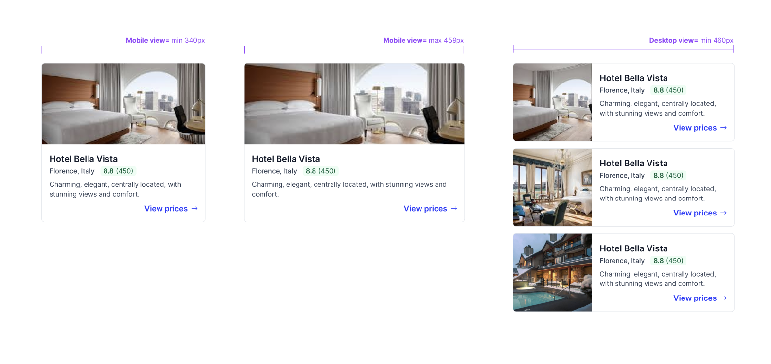
List variant across mobile (340px, 500px) and desktop, showing the responsive layout at each breakpoint.
Validation
We ran a beta test program with a select group of real partner blogs. 73% of partners who tried the widget retained it, a strong signal that it felt native enough to keep in their content. We also A/B tested the widget against existing text link CTAs to validate whether the richer format converted better. The results were promising. The plan was to follow up with an A/B test of carousel vs. list to understand which layout drove stronger conversion, but we didn't get there.
What didn't ship
The beta performed well but wasn't a business priority at the time, so we didn't push past it. The widget stayed live for beta partners but never saw a broader rollout. Left on the table: the carousel vs. list A/B test, the activities vertical for experience-driven content, and a Hub-based widget builder so partners could configure and preview without touching code. All designed, none shipped. Sometimes that's just how it goes.
Takeaway
The hardest part wasn't the UI, it was understanding when and where the widget belonged. A well-designed widget on the wrong page converts nothing. The research defined the brief as much as the design did.