The problem
The tables were holding the product back. As the platform prepared to onboard real clients, two things made it clear a fix was overdue.
- No visual hierarchy: content was left-aligned with no headers, no consistent spacing, and no clear structure
- No component system: every page had its own one-off solution, making each new feature a mess to build
Bulk actions, column customization, filters: all harder to ship than they needed to be because nothing was built on a shared foundation.
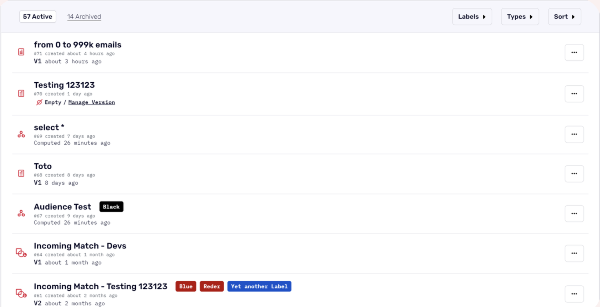
The original table listing: no column headers, no visual hierarchy, and no consistent structure across pages.
The approach
Before touching Figma, I mapped out every component that lived inside a table listing across the platform, then ran internal interviews to understand where things were actually breaking down.
- Component audit across all table listings: headers, CTAs, filters, sort, search, pagination, bulk actions, status pills, labels, kebab menus
- Internal interviews with sales and engineering to capture real pain points
- User personas built around non-technical users. If they can navigate easily, technical users can too
External research wasn't possible yet (the user base was small), but the internal signal was directionally strong. The personas gave us a clear bar to design for.
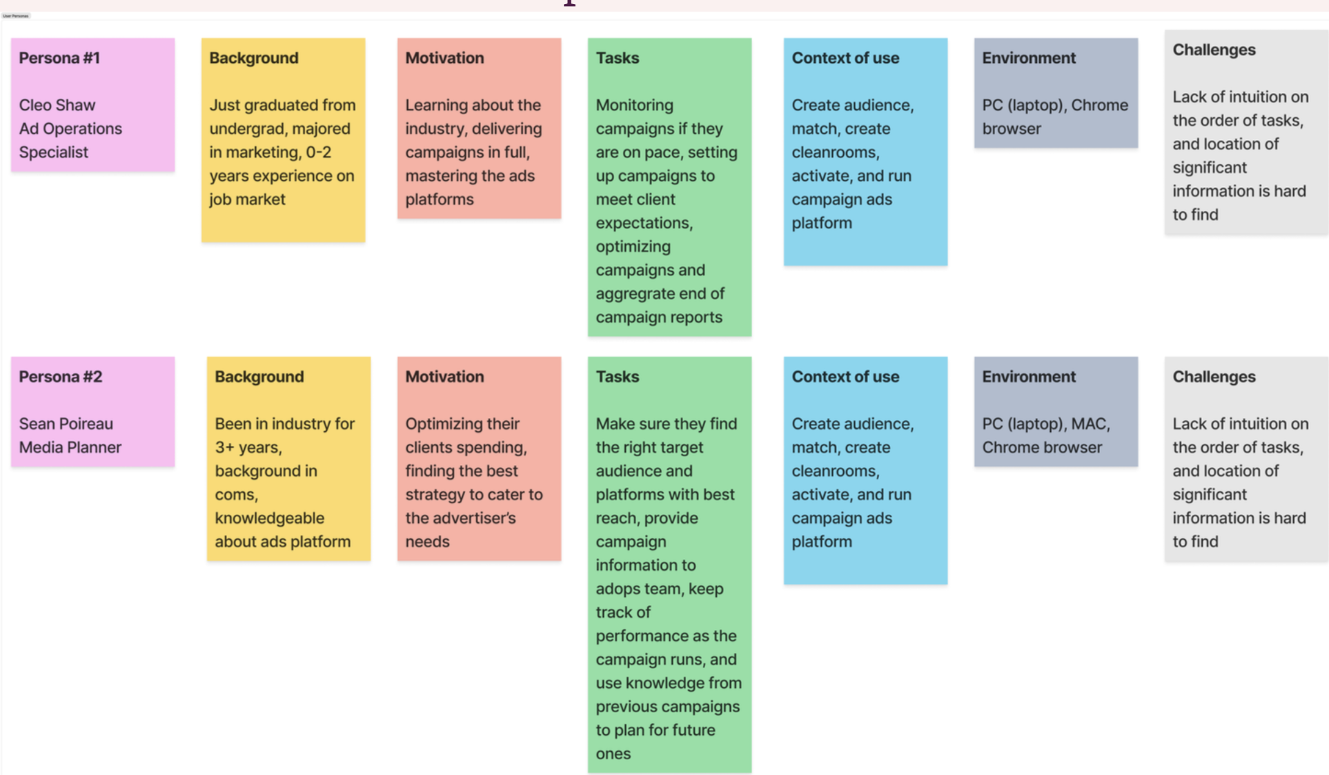
User personas focused on non-technical users. Designing for the harder case meant anything we shipped would hold up for everyone.
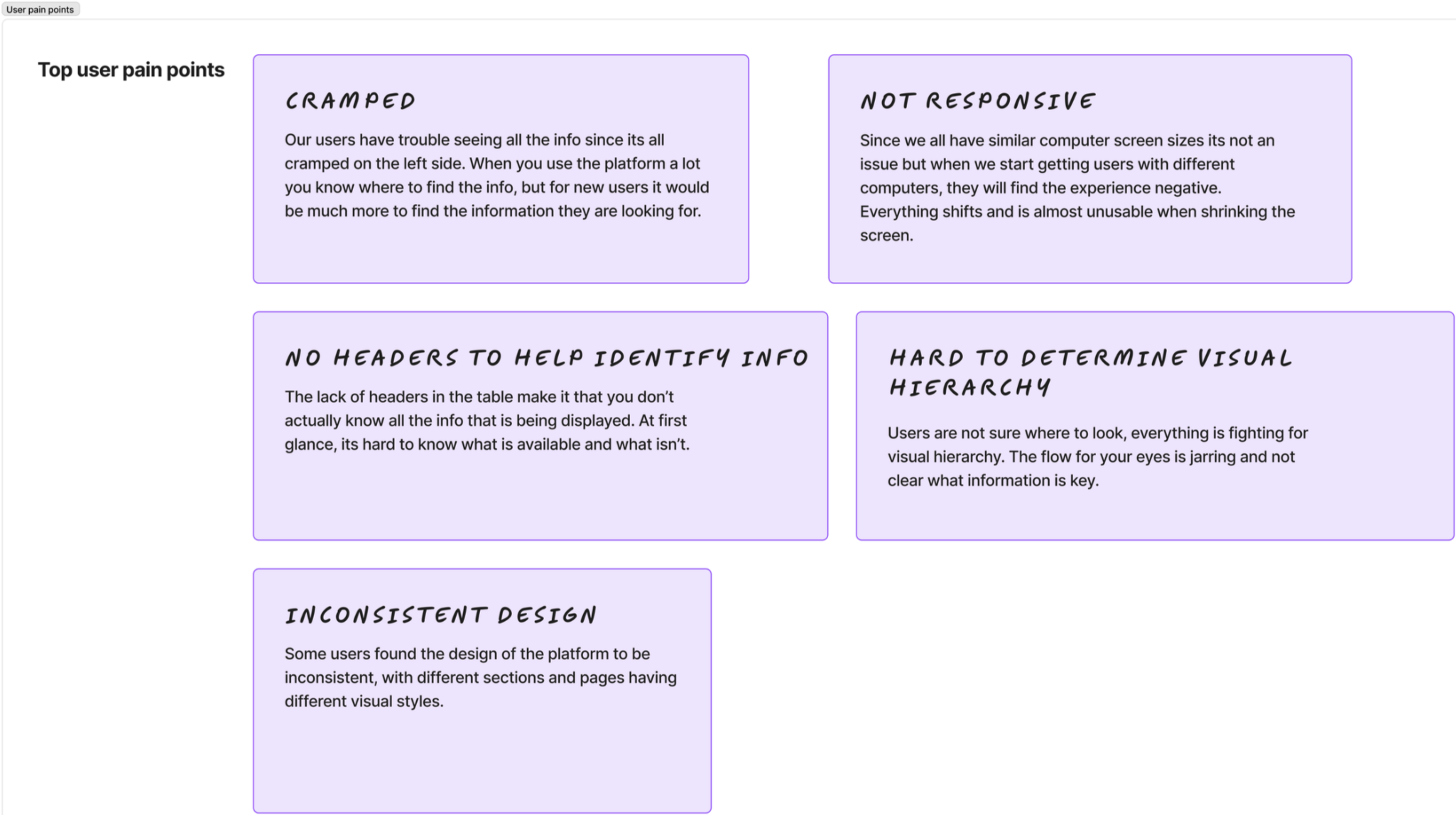
Key pain points surfaced through internal interviews: cramped layout, no responsive behavior, missing headers, and inconsistent visual design across pages.
The design
I tackled it in tiers: prioritize the most problematic pages, hand off to engineering, observe, then move on. This kept the Figma files manageable and let us learn before committing to the next page.
- Column headers with clear visual hierarchy
- Checkboxes for bulk selection
- Utility bar: search, filter, sort, and primary CTA
- Pagination and empty states
- Responsive behavior: columns collapse and the table scrolls at smaller sizes
Bulk actions got descoped in the first iteration: resource-heavy and not a client priority yet. Labels moved out of their own dropdown and into filters. Small calls, but both came from conversations with PM and engineering, not made in isolation.
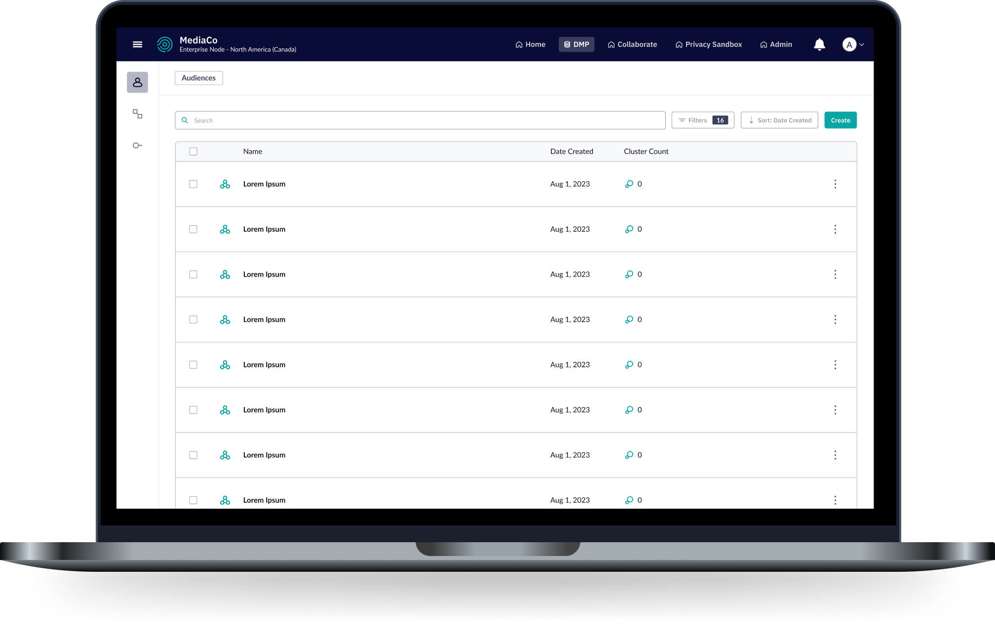
The shipped design. Consistent headers, clear hierarchy, and a utility bar that scales as features get added.
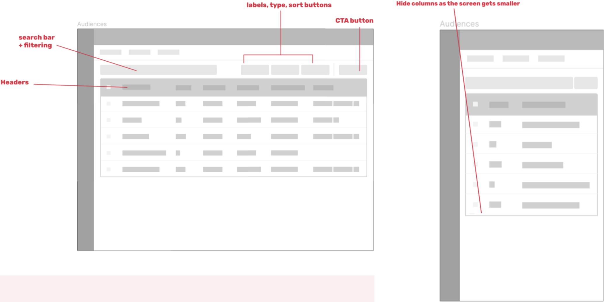
Early wireframes annotating the new utility bar structure: search, filter, sort, CTA, and column headers.
Takeaway
A design system project lives or dies by how well it's broken down. Tackling components individually before integrating them meant each piece got proper attention without losing the thread of the whole. The tiered rollout meant engineering could ship incrementally, which on a small team with limited resources made the whole thing actually possible.